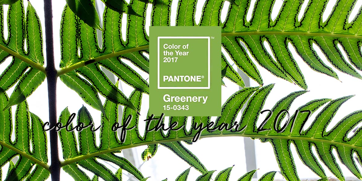
Curious to see what this year will bring us in the land of fashion & trends? This is the color of the year 2017: greenery
Each year a new color is picked by Pantone, the institute of color. This yeah, for 2017, they have picked greenery to be the color of the year. A fresh bright shade of green. The color is vivid, yellow-ish with a zest tone. According to the institute it symbolises a new beginning. Something we’re all in need of, in the current society. It gives a feeling of being outdoor, of living, renewing and recovering. Inhale, exhale, seeking happiness, personal passion and vitality are what the color greenery will bring you. Click on the image above to see an inspirational video about the chosen color.
This color will be the main focus in 2017 for fashion, interior design, accessories and art. It’s perfect to combine in each season. It blends beautifully with natural colors, and bright colors. Besides that, it also matches deep and darker colors, metallics and even the colors of 2016, Rose Quarts (light pink) en Serenity (baby blue). You can check out the color palettes they have developed on their website.
pantone
The color institute of Pantone is worldwide known for its color standards. I’ve always worked with these indications of colors when I was working in the fashion industry as a product developer. Whenever there was a new color added to the collection, it had a pantone number to correspond with. It’s an easy method, because wether I would be talking to my colleague in China, or in Italy, all knew which color I was talking about based on the color books. Based on these I would receive a lab dip, which I would cross check with the pantone standard. This way each and every fabric in the shops are single checked. Now you know what happened when you can’t find anything matching in the store. Oops!

color
“Ai!” That was my very reaction to this color. I mean, I love green, the deeper and darker tones. This bright color wasn’t what I expected to see. Perhaps in accessories, in interior yes, but not so much for beauty and fashion. It takes some time to get used to, but hey the year had just started! The good part of this bright, fresh greenery color is that it does match to most colors of the past season. It’s goes perfectly with white, cream but also with khaki and taupe. I guess we will see it mostly in prints and details though. I’ve searched the webshops for some matching items, and came up with these cute items. Click on the image to check out the details.
pantone has released a video about this colour:
how do you feel about this color and will you wear it?
source: pantone | images: unsplash.com


wat vind jij?